
The 12 Most Gimmick-y Gimmick Comic Covers of the ’90s
 |
?Ah, sweet decadence. In the ’80s, it was Wall Street suits sniffing only the finest China White off of the finest imported prostitutes. There was nothing they couldn’t do. In the ’90s, it was comic book companies selling millions of comics, trying to squeeze more cash out of readers by pulling all kinds of crazy stunts. Variant covers might seem like a no-brainer nowadays, but they’ve got nothing on Image, DC, Marvel and Malibu comics from the ’90s with holofoil, gatefold, embossed and even pop-up covers — basically, anything companies could do or glue to a comic, they did in hopes they would spur sales, and bizarrely, they usually worked. Here are 12 of the craziest comic cover cash grabs from a decade jam packed with them.
12) Batman #530
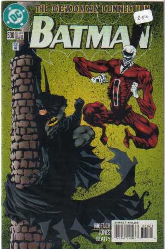 |
?Glow-in-the-dark covers were a dime a dozen in the ’90s. Some of them were pretty crappy, with just certain elements on the page colored with the ink, while others took it a step further. Take this issue of Batman which guest stars Deadman, a character who could only communicate with the living by inhabiting the dead. The glow-in-the-dark element reveals Deadman taking over Batman with art by the ultra creepy Kelly Jones. (DC, 1996)
11) Gen 13 #1
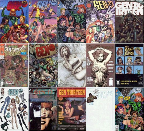 |
?One of the few gimmicks to last the test of time has been variant covers. Obsessive comic fans will grab anything and everything involving their favorite book, character or artist which fuels companies like Dynamite and Top Cow who put out slews of these things. One of the first companies to really embrace this tactic was the then-new Image with books like Gen 13 and DV8 coming out with covers corresponding to the numbered titles. Gen 13 borrowed from comics, magazines, music and fantasy art for inspiration with some fun, but expensive results. (Image, 1993)
10) Action Comics #695
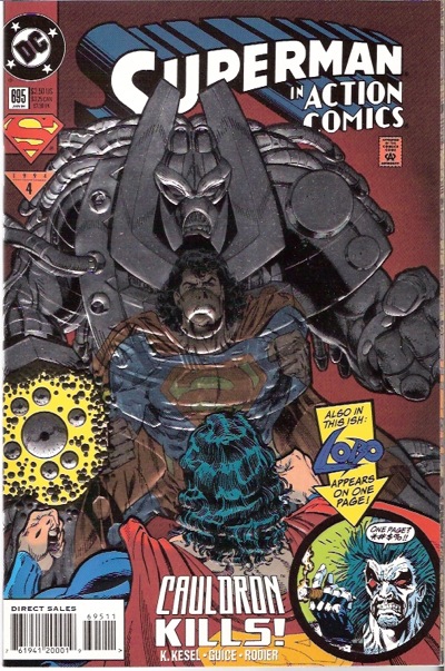 |
?Embossing is when part of the cover is raised and usually gets a shiny quality to it. Sometimes it can really add to a cover, especially if it’s someone like Silver Surfer. Back in the day, the best covers didn’t bother us, but something like this issue of Action Comics was really annoying because it introduces a villain named Cauldron who, of course, has a metal suit. You know what no one has ever said? “Remember how awesome Cauldron was?!” Nope, cause he’s a lame villain that didn’t deserve the extra effort or cash. (DC, 1994)
9) Amazing Spider-Man #365, Spectacular Spider-Man #189, Spider-Man #26 and Web of Spider-Man #90
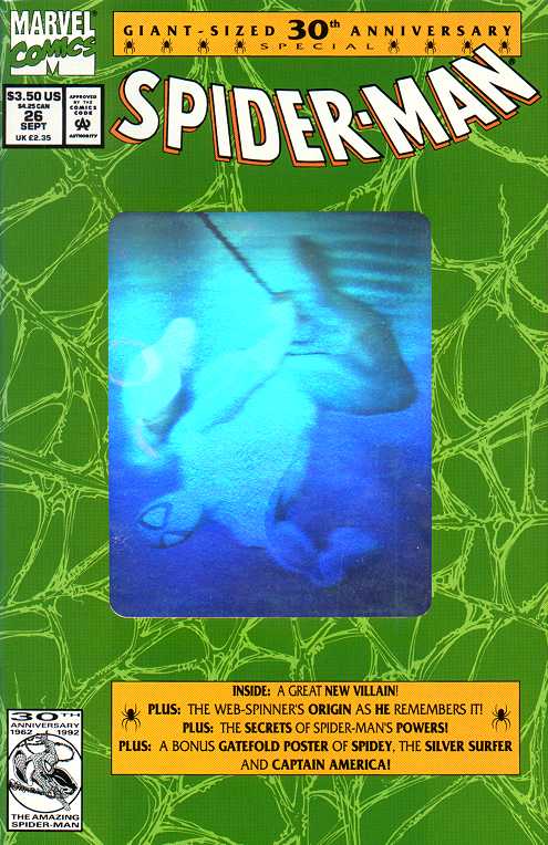 |
?As kids, we loved holograms. From baseball cards to those crazy 3-D pictures, it was all good. Until they came to comics in the early ’90s. Take these 30th anniversary Spider-Man comics for example. We’re pretty sure there were better holograms on cans of Spaghetti-Os around the same time. This is Spider-Man, one of the most acrobatic heroes of all time and this gimmick managed to turn him into a blocky, awkward rainbow of boring. (Marvel, 1992)
8) Avengers #360, 363, 366 and 369
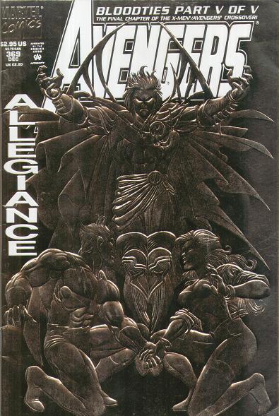 |
?Action Comics #695 aside, embossed covers tended to celebrate a momentous occasion or anniversary and were spread out over a wide variety of titles so certain fans wouldn’t get too burnt out. Well, unless you were an Avengers fan in 1993 when, for some unknown reason, Marvel decided to make a every third issue a 48 page giant with an embossed silver cover. What made things even worse was that they didn’t offer a basic newsstand version for cash-strapped fans, which even DC did with that dumb Cauldron issue. (Marvel, 1993)
7) Amazing Spider-Man #400
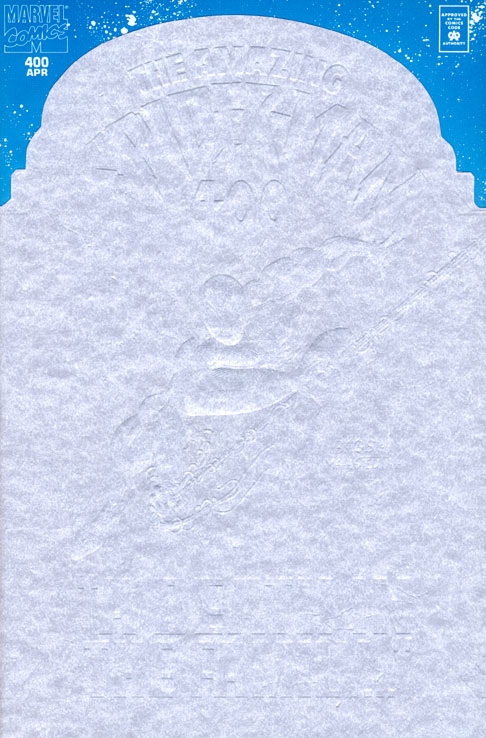 |
?By the mid-’90s, the companies weren’t content to do just one gimmick per cover and started combining them. The Punisher: War Zone #1 cover was both die-cut and embossed which actually looked cool with that John Romita Jr. artwork. On the other hand, there’s this Amazing Spider-Man #400 cover with a die-cut white thing over a boring blue background. Edgy. (Marvel, 1995)
—-
6) Robin III
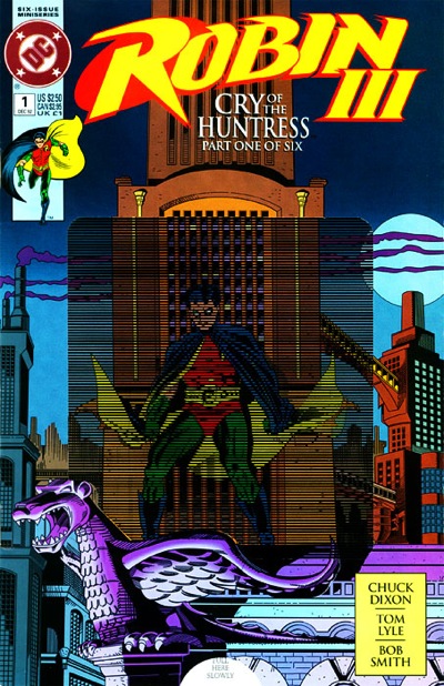 |
?Before getting his own comic, third Robin Tim Drake popped up in a few minis, the second of which had a different, crappy hologram awkwardly worked into the cover. The next miniseries, called Robin III: Cry Of The Huntress and came polybagged because each issue was “movement enhanced” thanks to a weird lenticular kind of cover. The moving panels could be switched out to mix and match, but the gimmick wasn’t cool enough and, as far as I know, hasn’t been used again. (DC, 1992-1993)
5) Sleepwalker #19
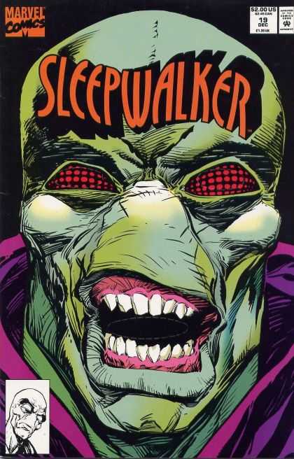 |
?Who is Sleepwalker, you might ask? Who cares, it’s not important to the story. The only reason you need to know anything about the character is that once upon a time the 19th issue of his comic book was deemed worthy of a fairly novel gimmick cover: a die-cut mask of the character. Why not use this on a character who’s, you know, popular? God only knows. (Marvel, 1992)
4) Protectors #5
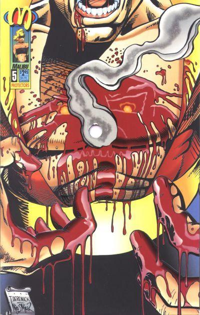 |
?Sucking chest wounds might not seem like the best thing to draw in customers, but that’s what Malibu went with when trying to drum up some interest in Protectors #5. See, the hole in the dude’s chest on the cover actually goes through the entire issue and is somehow coordinated with the artwork. Yet another ambitious gimmick that could have been better utilized on another comic. Like Punisher. (Malibu, 1993)
3) Superman: Man of Steel #30
|
?For those of us without an even remote amount of artistic talent, creating our own comic book cover is a dream we never expect to accomplish. Maybe DC was thinking about fans like us when they released Superman: Man of Steel #30 which featured a fight between Big Blue and Lobo. To celebrate yet another meeting between these two brawlers, DC offered this design your own cover element with a glossy cover and, for lack of a better tern, Colorforms. Put ’em on the cover or anywhere else you could think and you had a pretty good bang for your comic-buying buck. (DC, 1991)
2) Eclipso: The Darkness Within #1
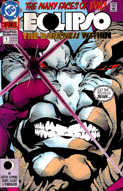 |
?This one must have seemed ingenious on paper. Eclipso’s a villain in the DC Universe who gets his power from a purple gem he carries around. So, it would make perfect sense to actually attach a cheap gem to the front of this one-shot special right? Nope. See, when you pile up a bunch of comics in a box there’s a lot of pressure and with those plastic novelties in there, plenty of comics got ruined. We’re all for being one-of-a-kind, but not at the expense of innocent comics. (DC, 1992)
1) The Mighty Magnor #1
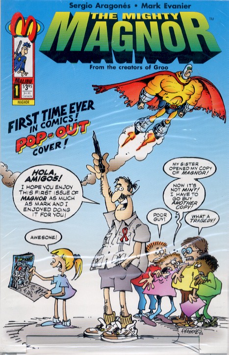 |
?Leave it to Malibu to try something completely different while everyone else churned out holofoil and embossed covers. This time around, they dropped The Mighty Magnor by Mark Evanier and Sergio Argones, a spoof comic that actually sported a pop-up cover. Now this is a gimmick we wouldn’t mind see getting explored a little better today. Hey, it might get people to buy actual comics instead of digital versions. (Malibu, 1993)