Oh Hai DC Comics’s New Company Logo
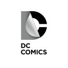 |
?Well, I don’t know that it makes me want to buy comics from them, but I might ask them to help find an aggressive business solution to managing my marketable paradigm in a fast-paced global economy. Their logo makes me think they’d be good at that. (Via Bleeding Cool)
About The Author
Robert Bricken is one of the original co-founders of the site formerly known as Topless Robot, and its first editor-in-chief, serving from 2008-12. He brought the site to prominence with “nerd news, humor and self-loathing” as its motto, raising it from total internet obscurity to a readership in the millions, with help from his savage “FAQ” movie reviews and Fan Fiction Fridays. Under his tenure Topless Robot was covered by Gawker, Wired, Defamer, New York magazine, ABC News, and others, and his articles have been praised by Roger Ebert, Avengers actor Clark Gregg, comedian and The Daily Show correspondent John Hodgman, the stars of Mystery Science Theater 3000 and Rifftrax, and others. He is currently the managing editor of io9.com. Despite decades as both an amateur and professional nerd, he continues to be completely unprepared for either the zombie apocalypse or the robot uprising.