
10 Horrible Paintings from Atari 2600 Game Box Art
 |
?By Shaun Clayton
In the days of the 2600, games were simple and didn’t look
very good. Therefore, the outside of the game box tried to compensate with
elaborate paintings of an incredibly loose interpretation of what the game what supposed to be about. These could work out pretty well, but many times — many, many times, actually — the paintings sucked, either because the game gave no inspiration to the struggling artists the game companies hired, or because the companies just hired crappy artists (and sometimes, both). Here are ten of the worst pieces of box artwork,
obtained from scans from the fine people at AtariAge.com.
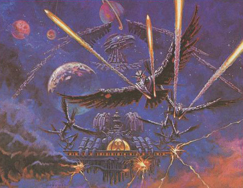
10) Phoenix

 ?
?
I don’t know if this is the
most awful or the most awesome Atari box art ever. It certainly looks like it
could be a double album from Slayer called Birds of the Apocalypse 8: Hell’s
Aviary. There’s fire, there’s lightning, there’s a bird so big he makes the
planet in front of it look small. I can only call this album art awful because
the artist seems to have taken a concept and gone insanely too far with it – if
you paint something like this, then the game has to at least slightly match it in
awesomeness, and it does not.
 ?
?
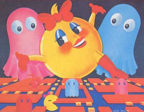
“Hey Pinky, I’m just
wondering…”
“Did Pac-Man get a sex
change? Yeah. I think so.”
“It’s a good thing I’m
already dead.”
I mean, really, that’s the
only impression I get from this artwork, that there’s Ms. Pac-Man, and the
ghosts are completely bewildered/scared. Only thing I can think of is that
Pac-Man, in a desperate effort to avoid being unemployed in the home video game
crash of 1983, (which some say the original Atari Pac-Man game caused by being
totally awful) got a sex change so he would be put into another game.
either:
I don’t want to know what
the “more” is of “I’m more than Pac-Man with a bow.”
 ?
?
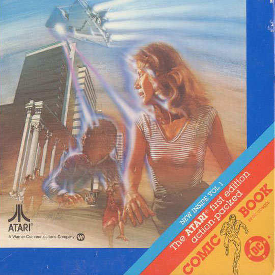
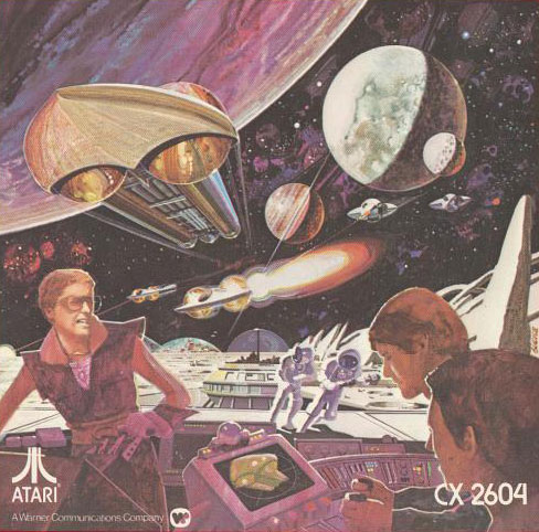
“Look out, that Imperial
Star Destroyer just shot that guy and woman!”
when looking at this artwork. It isn’t terribly painted, it’s just got an
Imperial Star Destroyer knock-off shooting (or beaming up) two people. I mean,
even the Atari version of this game clearly has the aliens looking like flying
squid. I feel like the artist merely thought “Oh, it’s uh, a sci-fi game, and
nothing is more sci-fi than Star Wars.”
knock-off kind of looks like the Venator-class Star Destroyers, which makes
sense as the Star Wars prequels were kind of like poorly-thought out knock-offs
of the originals.
included was pretty awesome.
 ?
?
“Space Robert Evans, hurry
with that lever!”
“Shut your face, sweet
cakes, I’m getting over a hangover.”
“I need you to hurry up so I
can fire this laser and destroy this ship that’s right above us!”
“Won’t the explosion also
kill us?”
“There’s no time to think, I
have no idea which part of this spacecraft is the front!”
Thus is it in what must be
the fantastic year of 2005, where the aesthetics of the 1970s never died and
technology jumped ludicrously forward.
depicted on the box art shows you a very exciting game, when the actual game of Space War involves you:
? Flying a triangle around
? Shooting at another triangle
? Dealing with the effects of
gravity
So, yes, no shooting at
spacecraft from a Space colony with Space Robert Evans while Space Astronauts
run. Lame.
6) Video
Pinball
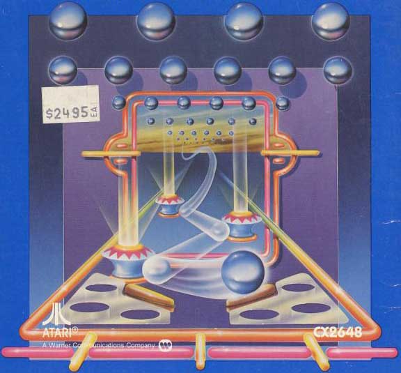 ?
?
“Hello Trapper Keeper Art
from the 1980s, how are you doing?”
doing?”
“You realize how horribly
dated you are, right? I mean, look out neon world, balls are coming from the
nether-realm to attack you!”
killing myself many times.”
Though not part of the
original artwork, I personally like the price sticker included with this scan. It
certainly feels like it should be part of the original artwork, what with its
cheap non-thoughtfulness.
5) Pole Position
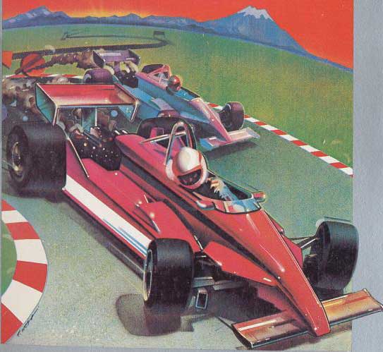 ?
?
There seems to be no proper
horizon on this drawing. Is that a sun in the background below the sunset? I
can’t tell. This looks less to be a game about racing and more a game about how
not to draw cars. The car looks broken. The car looks like it’s front end just
snapped and the driver is saying “Oh shit.” The car also seems to be on fire. Exciting
broken car on fire racing excitement! Who doesn’t want to play?
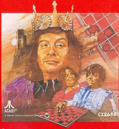
4) Video Checkers
 ?
?
“Well, King — I, as a
round-faced chub, appear to have beaten your in your own game!”
“I, as your round-faced
girlfriend, congratulate you on your smugness.”
your head.”
This is all I think of when
seeing this artwork. Not checkers, mind you; just a smug, chubby guy getting
beheaded.
3) Realsports Soccer
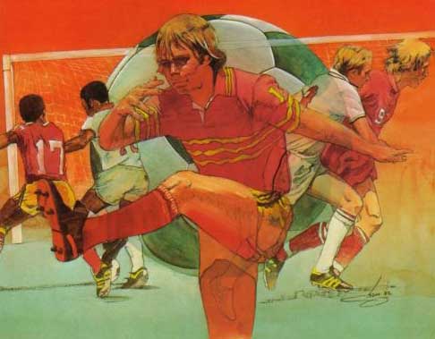 ?
?
“I do believe my finger
smells like poop.”
farting while musing about the smell present on his finger. Or maybe he’s
working for the Ministry of Silly Walks. All I can think of is not “What a
great soccer game this must be” but “guy smelling finger.”
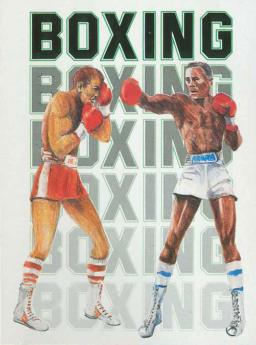 ?
?
This is really a terrible
piece of art. It’s like a drawing of two very fit guys between the ages of 50
and 120, with one trying to throw a punch with absolutely no power and the
other putting a glove over his eye and pretending he’s a pirate.
since this is on one of the “RealSports” titles which was to indicate “It’s
like playing real sports!” Which, no, no it’s not. Unless the previous version
of boxing was a game in which you were merely trying to turn a space alien into
a box, then this game isn’t more realistic.
 ?
?
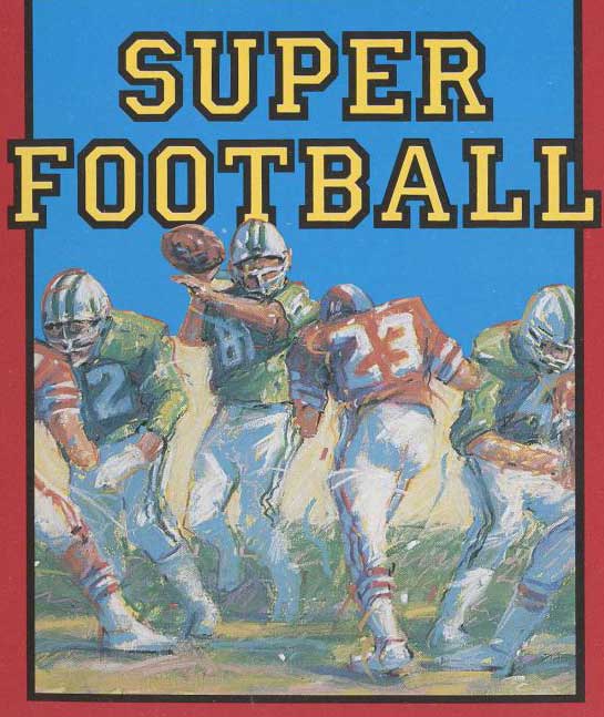
actually isn’t bad for an Atari sports game but you can’t tell from the
sort-of-impressionist-but-not-really artwork here. Whatever it is, it seems
like the work of some fourteen year old who is trying to show his drawing “skillz”
and boy does it suck. See the quarterback who, may or may not be playing for
the Jets, casually think about throwing a football against someone who may or
may not be playing for the Redskins. Seriously, a picture of a football would
have been better.
About The Author
Robert Bricken is one of the original co-founders of the site formerly known as Topless Robot, and its first editor-in-chief, serving from 2008-12. He brought the site to prominence with “nerd news, humor and self-loathing” as its motto, raising it from total internet obscurity to a readership in the millions, with help from his savage “FAQ” movie reviews and Fan Fiction Fridays. Under his tenure Topless Robot was covered by Gawker, Wired, Defamer, New York magazine, ABC News, and others, and his articles have been praised by Roger Ebert, Avengers actor Clark Gregg, comedian and The Daily Show correspondent John Hodgman, the stars of Mystery Science Theater 3000 and Rifftrax, and others. He is currently the managing editor of io9.com. Despite decades as both an amateur and professional nerd, he continues to be completely unprepared for either the zombie apocalypse or the robot uprising.