Welcome to the All-New, More Topless Topless Robot
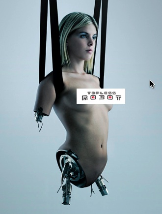 |
?Here it is, Topless Roboteers. There’s a new look here at Topless Robot, and I can’t tell you how engorged excited I am. I loved the old C3PO-looking stripper-bot, but Topless Robot looked kind of old even when it first began in January ’08; having more features, more functionality, more space for the articles (and their accompanying videos and pictures) and a robot that actually matches the one on the shirts I’ve been giving out for the past year is, I feel, a good thing.
But the new Topless Robot is more than just good looks! There’s the new popular Tags bar, along with sidebars for the most popular articles and the most recently commented on. Yes, I know 9/10ths of other blogs already have things like these, but now I do, and that’s why I’m excited! Oh, and now you the ability to reply to people’s comments directly, so you guys can have your bitchy nerd fights more effectively (and the rest of us can ignore them more effectively).
Now, there’s aren’t commenter profiles and log-ins yet, but they’re still on the list, and they’re coming. I promise I want them at least as bad as you scamps do. I’ll keep you posted, promise.
Frankly, I think all of this is peachy keen, and I have a hard time imagining any of you guys complaining about any of the new functionality… with the possible exception of the new Topless Robot robot. If you do, you’re in luck — I’m announcing a new contest at TR today: Design a New Topless Robot for Topless Robot. Send me art of a new robot exemplifying toplessness (without being actually nude) that fits in the space above where the current robot is, and your work might become the new TR logo. Five entries will get Topless Robot t-shirts; the winner will get a shirt and $300 worth of nerdy shit, which I will purchase to make sure it’s appropriately nerdy.
Any robot style — ’50s, anime, wind-up toy, etc. — is acceptable; the contest will continue until somebody’s art knocks my socks off.
And that’s it. I’m sure there are still a few bugs in the system, so feel free to email me if you see something not working right or not working at all. And thank all of you for sticking with TR long enough to make this new design possible. If I were your DM, I’d totally be giving you Treasure Type H right now in gratitude. Free maps and scrolls for everybody!
About The Author
Robert Bricken is one of the original co-founders of the site formerly known as Topless Robot, and its first editor-in-chief, serving from 2008-12. He brought the site to prominence with “nerd news, humor and self-loathing” as its motto, raising it from total internet obscurity to a readership in the millions, with help from his savage “FAQ” movie reviews and Fan Fiction Fridays. Under his tenure Topless Robot was covered by Gawker, Wired, Defamer, New York magazine, ABC News, and others, and his articles have been praised by Roger Ebert, Avengers actor Clark Gregg, comedian and The Daily Show correspondent John Hodgman, the stars of Mystery Science Theater 3000 and Rifftrax, and others. He is currently the managing editor of io9.com. Despite decades as both an amateur and professional nerd, he continues to be completely unprepared for either the zombie apocalypse or the robot uprising.