
The Ten Worst DC “New 52” Costume Redesigns
Special thanks go to “earthmanprime” for the idea for this list.
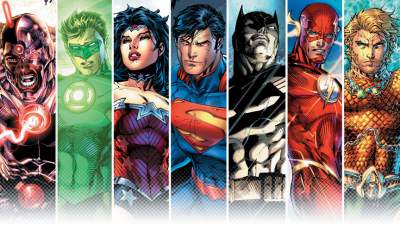 |
As we approach the two year anniversary of DC Comics’ New 52 reboot, it’s time to take a moment and reflect back at some of things that DC screwed up from the get-go; namely, their costume redesigns for most of their top tier heroes. Jim Lee was given the task of redesigning most of the major iconic DC heroes, and although I maintain that Jim Lee is a great artist, his design aesthetic seems to be permanently stuck in the ’90s. While a select few DC characters got to keep their iconic looks in this new rebooted universe (Catwoman, Aquaman, and Stargirl for some reason were spared) The following characters were not so lucky…
10. Wonder Woman
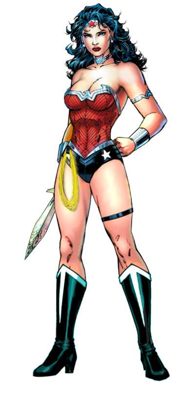 |
Of all the main characters of the newly revamped DC Universe, I actually find Wonder Woman’s redesign maybe the least offensive, especially compared to the look she was wearing in the old continuity just prior to the whole reboot. From just a design standpoint, the new Jim Lee-created look is fairly lovely, it evokes the classic silhouette and adds nice new details, like the stars alongside the torso merging into the famous stars on her short shorts. But the whole color design is just off, and doesn’t reflect who the character is, or at the very least, who she is supposed to be. It feels like DC decided to take the bright blue, red and gold and turn them into darker hues of burgundy, navy blue (almost black) and silver. Wonder Woman isn’t a “dark” character, and her color scheme should reflect that.
I can’t help but feel like this is a reaction to make Wonder Woman’s costume reflect Superman’s a bit less, but those colors aren’t just Superman’s colors, they’ve been as much Diana’s colors as his for over seventy years now. I’d say she has much claim to red, blue and gold as Superman does. And if DC didn’t want Wonder Woman to just feel like an appendage to Superman, then maybe they shouldn’t have had them become a couple then. But that’s another argument for another list I’m afraid. Maybe the biggest flaw design wise is that her signature golden lasso now sticks out like a sore thumb, where before it felt like an extension of the gold parts of her armor. It should he noted that none of the other classic JLAers got their iconic color schemes effed with too much, or much at all. Make of that what you will.
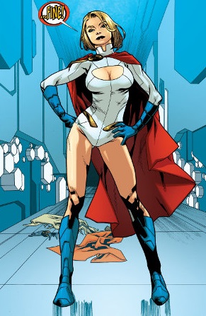
9. Power Girl
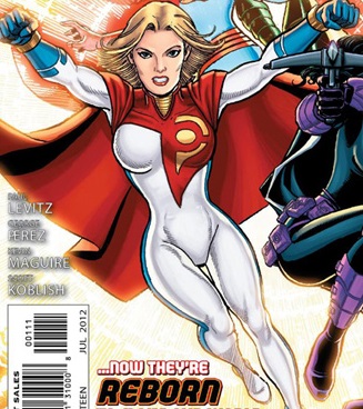 |
George Perez is a truly great comic book artist, and an industry legend for almost forty years now. What he’s not, though, is a great superhero costume designer. Much like Jim Lee, another exceptional penciler who also has a crazy attention to detail, he kind of fails to understand that sometimes, with superhero costumes, less is more. When Power Girl officially debuted in the New 52, gone was her classic look and the infamous boob window; instead, we got what looked like a white jumpsuit, and a red cape, with a giant red letter P over her left breast. I guess this was thought to replace the boob window and still draw attention to her boobs, or at least boob, singular. Fans really didn’t like this new look, probably more vocally than some other character’s costume replacements, and within a year, a variation of Power Girl’s original outfit was back…although with certain New 52 enhancements (lots more piping.This will be a theme.) But considering how it looked just before, fans welcomed the new “old” PG costume back with open arms.
 |
8. Superboy
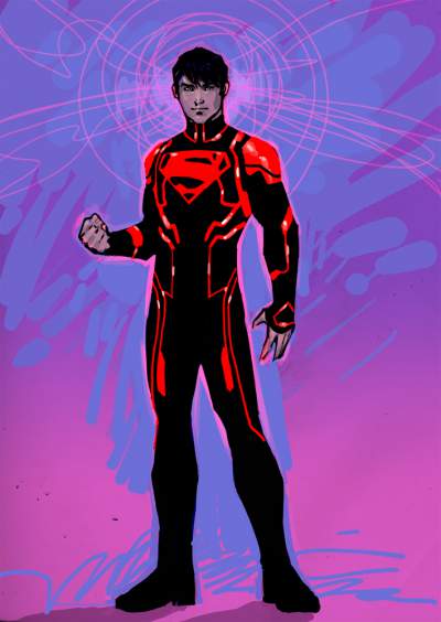 |
At number eight, the first male hero on our list (and first member of the Superman family) is Superboy. The modern incarnation of Superboy, the version that is a clone of Superman and a human donor and not just Superman as a boy, has always had a bit of a troubled costume history. First appearing as one of the five replacement Supermen after Superman’s “death” in the early nineties, he even then wore a pretty hideous outfit that screamed everything that was bad about the nineties, from the haircut, to the leather jacket, to you name it. After a couple of other ugly costumes followed, Superboy settled on a simple look – a black Superman T-shirt and jeans. And oddly enough, this is the look that worked, and stuck with the character the longest. It’s the “costume,” for lack of a better word, that he wore while a member of Geoff Johns’ Teen Titans, and as a character on Cartoon Network’s Young Justice, making it arguably his most well known look.
Cut to the New 52, and this new incarnation of the Boy of Steel is wearing something inspired by the Tron movies, it seems. It keeps the red “S” Shield on black, but now has all kinds of red piping all over it, which I assume is supposed to be like red neon piping. It’s way too busy, and while it might look kind of cool in a live-action movie, where it would be actual light or something, on the comics page it’s really just an overly designed mess. How I now long for the days when just a T-shirt and jeans would cut it. Hey DC, here’s a suggestion: How about you have Superboy wear the T-shirt and jeans look Superman wore at the start of the New 52 Action Comics run by Grant Morrison?
 |
7. The Flash
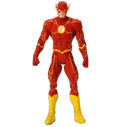 |
The Flash, at least post Jay Garrick, has always had one of the sleekest costume designs in comic book history. The man who designed it, the late artist Carmine Infantino, pretty much nailed it the first time around. Ever since 1956, the Scarlet Speedster, be it Barry Allen or Wally West behind the mask, has worn a variation on that classic look. Sure, some updates were done over the years, sometimes there were whited-out eye sockets, sometimes not, and other times the costume was made to look somewhat chromey and shinier in appearance, but for the most part, the basic look remained.
And while the basic look more or less still remains, it is now is filled with all this unnecessary crap on it. Much like Superman’s costume, and pretty much everyone else’s it seems, there is all this needless piping everywhere, ruining what was once a clean, simple look that made a big bold statement. I’ll admit, when the character is shown running and the lightning forms around him…it does look kinda cool. But when the character is just standing still, just talking to someone in a panel or hanging out, it looks overdone as all get-out.
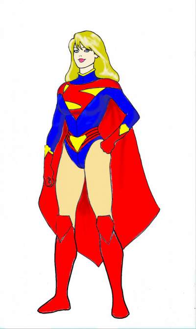
6.Supergirl
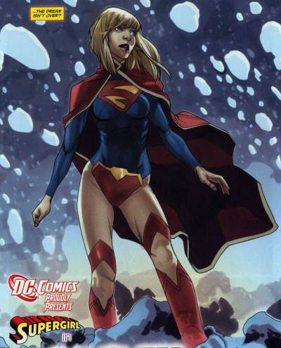 |
I will admit, there is one aspect to Supergirl’s New 52 look that I think is pretty cool: namely, the cape. The new version of the cape looks kind of regal, and also is a bit of a throwback to some of the crazier costumes the character wore in her experimental phase in the early seventies, where she seemingly had a different costume every other month. But aside from the cape, I’m afraid the rest of the New 52 Supergirl look is just fugly and poorly conceived. First off, instead of wearing a leotard with a skirt over it, or pants, or just shorts, she seems to be wearing a tight longsleeve shirt that ends right at her waist. And then she has some kind of big S-Shield shaped vagina protector on that’s attached to the front of it. It’s the weirdest thing I might have ever seen worn on a mainstream female superhero from a major publisher, or at least one of the most offensive. And then there are the boots – they’re not thigh-high boots exactly; they come over her legs and leave her knees exposed for some reason, and just look like they couldn’t decide whether Kara should wear thigh-highs or shorter boots. So they came up with this weird, in-the-middle thing that just doesn’t work.
Now here is the weird part: for the Earth-2 version of Supergirl (who eventually comes to the main DCU Earth and becomes Power Girl, and also starts wearing a fug costume; maybe there is something in the water of Earth-Prime) she was shown as having a far better costume than the one we are stuck with, as designed by artist Kevin Maguire. I wish this look hadn’t been relegated to just flashback use only for Power Girl, as in my opinion it is the far superior costume than the one Supergirl currently uses.
 |
5.Starfire
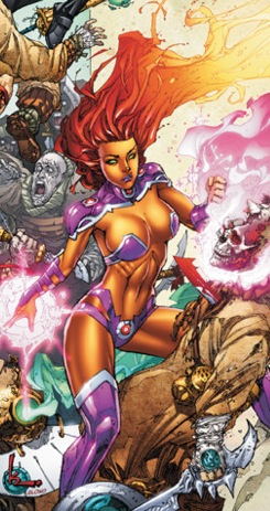 |
Ok, maybe I take back what I just said about Supergirl’s costume being the most offensive thing I’ve seen on a mainstream female superhero, because Red Hood and the Outlaws co-star Starfire’s New 52 Costume is certainly pushing the idea of what can even be called “clothing” on a female heroine. Certainly, the original Starfire costume was anything but prudish, and her breasts were pretty well exposed in that giant metal bra thing she used to wear, that looked kind of like something that a barbarian chick would wear airbrushed on the side of one of those vans from the seventies. But the New 52 costume is…I don’t even know where to start.
First off, she has some kind of purple armor thingy protecting her (apparently) very vulnerable shoulder and neck area, and then below, nothing at all but some big purple pasties covering her nipples. I’m guessing it’s kind of a metal bra thing, but it kind of seems to defy the laws of physics. There comes a point where you wonder why she bothers wearing a costume at all. It is all the elements of bad ’90s Image Comics designs rolled into one costume, and poor Princess Koriand’r of Tamaran had to pay the price.
4.Harley Quinn
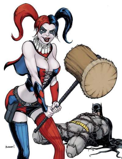 |
The original Harley Quinn look, designed by Bruce Timm for the classic Batman: The Animated Series, is beautiful simplicity itself. But if the designers of the New 52 hate anything, it’s simplicity. The original Harley Quinn costume, which evoked a classic Italian Harlequin, hence the name, has been replaced with some kind of amalgam of Suicide Girls and something from one of Todd McFarlane’s Twisted Toys line. Or maybe even something from a Rob Zombie movie.
Not all elements of the new Harley look are bad, mind you – I like how her hair is now parted into two big pony-tails that evoke the tassles that used to be part of her classic costume. But even though Harley has always been a sexy character, she never was one to show a lot of skin. She found other (crazy) ways to be sexy. But now, much like almost every female in the New 52, she is showing more skin and more cleavage. It’s all a little gratuitous if you ask me, and I really think Harley was one of those “if it ain’t broke, why fix it” characters.
3. TIE: Black Canary and Poison Ivy
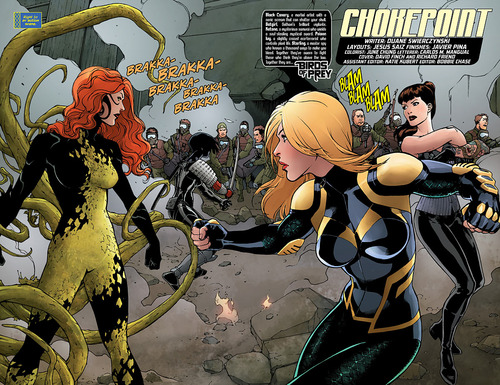 |
Two members of the Birds of Prey book make for a tie entry, both having had way better looking costumes before. Black Canary traded in her simple black motorcycle jacket and fishnets for this overly designed blue number. And poor Poison Ivy; the mother nature costume made of leaves might have been a little cheesy, but it was ten times better than the one piece she’s stuck with now, that’s half black and half green and all ugly. Hopefully at some point in the not too distant future, these two ladies pull a Power Girl and go back to their classic looks, or something close to it.
2. Lobo
 |
The recently revealed New 52 version of intergalactic bounty hunter Lobo is the latest character to get the new universe reboot treatment, and although the character has yet to debut officially, comics news sites went crazy this past week when pics of the new and “improved” Lobo hit.
For those unfamiliar, in the old DC Universe, Lobo was an albino bounty hunter who was essentially a Hell’s Angel, but who rode a big old space bike instead of a chopper. A version of the old school Lobo already has appeared in the New 52, but we are told that version was really an impostor, and this new one is the real deal. In the old DCU, Lobo was big, he was mean, and he was ugly, and that’s how his fans liked him. And now he looks to be made into something of a pretty boy for the New 52. I’m sure that will go over well; I can already hear all the cries of “Lobo looks gay now!” but I should remind everyone that the old Lobo looked a lot like a Tom of Finland drawing, so he wasn’t all that hetero lookin’ either before.
Although the design of this new Lobo is pretty sweet in and of itself, it’s so far removed from what came before as to really be another character entirely. You can’t help but wonder what DC is thinking with this one, but they’re already in damage-control mode, with writer Marguerite Bennett now swearing he won’t actually look like that when the issue comes out.
1. Superman
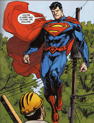 |
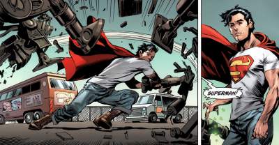
You might be asking yourself why Superman made the top of the list, or even the list at all. There are certainly worse costume redesigns as part of the New 52 initiative. But Superman is number one because it represents everything wrong with the whole New 52 thing in a nutshell, to take something beautiful, simple and iconic and muddy it up with tons of extra details no one was asking for. First off, I will admit there were some long needed and necessary changes made to Superman’s costume as part of the redesign, and I welcome them. I’m completely ok with Superman losing the red trunks; I’ve felt that was a long time coming. Having a red belt in its place was also good, as it gave the dash or red to break up all the blue, something the Man of Steel movie costume failed to do.
But then, there’s all the damn piping everywhere, giving the suit the appearance of armor. Armor, on possibly the one super hero who needs armor the least. Of almost all the superhero characters out there, Superman needs to have a costume that is easy not only for every comic book artist to draw, but more importantly, every young kid who loves the character to sketch in their notebook during class, and not worrying about whether or not they got too many of the lines in Superman’s costume right. .
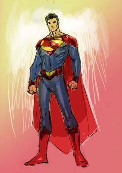
Much like Supergirl, the Superman of Earth-2 was also given a new costume, by Jim Lee,and in this instance, he really did a bang up job on the redesign, evoking the classic costume while still updating it all at once. The belt evokes the old red trunks (without being as silly) and there’s not a trace of all that piping to be seen. Also gone is the collar, which feels very un-Superman to me, as high collars like the one he sports now make me think of a military general. Hopefully at some point DC tweaks Superman’s costume yet again, and they could do worse than to use Jim Lee’s design from Earth-2.
 |
Dishonorable Mention: He-Man
 |
Though he’s not technically part of the New 52, that same urge to “fix” what wasn’t broken and make it all kinds of wrong has also infected DC’s take on Prince Adam’s alter-ego. He-Man’s look was always fairly classic stuff – he was basically a blonde Conan, and as the most powerful man in the universe with an indestructible sword, he didn’t need a whole lot of extra augmentation. So after a decent, reasonably faithful start, DC of course decided that what would make He-Man better is an armor that looks like it’s on loan from Eternia’s answer to Tony Stark, who, for the sake of argument, we’ll call Drinkor. Meanwhile, they gave Teela even less clothes, presumably because somebody somewhere at DC was once called gay for liking He-Man, and is now overcompensating.
And if you think that’s bad, you don’t even want to see what they’ve done to Skeletor…
Previously by Eric Diaz:
The Top Ten Substance Abusers in Comics
Nine Reasons a Flash TV Show Could Be Better Than a Flash Movie
The Ten Heroes Most Unworthy Of Justice League Status (Who Joined Anyway)
