
10 Stunningly Misleading NES Box Art Covers
 By George Bently
Drugs. One can only blame illegal substances for the exceptionally large number of bat-shit insane, totally weird, fantastically awesome or otherwise completely misleading (yes, they?re all part and parcel of the same grouping) cover art designs to original NES games. Sometimes hilarious, sometimes tragic, these covers often had nothing to do with the game, as if the people bringing it over had never seen a single screenshot from the cartridge inside.
Trying to narrow the list of the hundreds and hundreds of NES game box covers down to the Top 10 Most Ridiculous is nearly impossible, considering that roughly one out of every three covers has a reasonably high ?What the fuck?? factor. So let?s dive in and highlight 10 completely ridiculous NES Box Art Covers and we can call it a day.
type="text/javascript">
10) Xenophobe

The game, according to the cover art: Alien: The Videogame!
The game, in reality: Well?kind of Alien: The Videogame, albeit a horrible, horrible ripoff of the Alien concept (Little creatures hatch from eggs and attack by latching onto players. If the creatures aren?t killed, they turn into bigger, meaner, more lizard-like beasts) whereupon players battle the alien Xenos from different levels and violence happens. Whatever. It worked pretty well in the arcade, but was utter shit on NES.
What the fuck? factor: 7/10. This could?ve been a simple footnote in silly NES covers but god damn that is one fucked up completely abysmal hack-job swipe of H.R. Giger?s xenomorph designs.
9) Bomberman
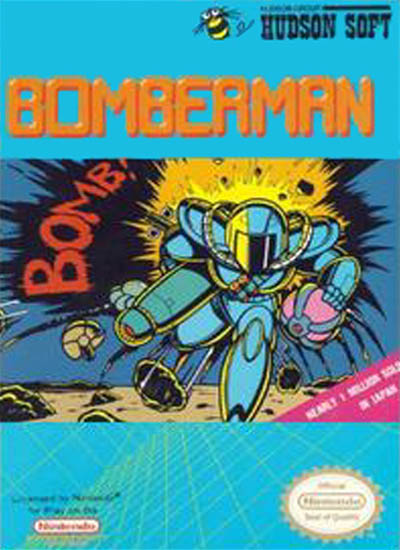
The game, according to the cover art: An explosion-fest maybe mixed with some sort of future football-type game. With bombs and explosions. Aces!
The game, in reality: A puzzle-y game with lots of explosions. Seriously, you just firebomb the shit out of those 8-bit levels.
What the fuck? factor: 7.5/10. Aside from the, ya know, bombs, there?s no real correlation between the game and the cover art. Which sucks. Explosionball would be a kickass game. Still, it?s not as disparate as our No. 1 choice. (Don?t skip ahead!)
8) Clu Clu Land
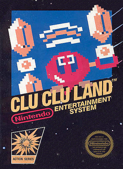
The game, according to the cover art: Undecided. There?s no fucking way any sane human could guess as to what this game could be by looking at the cover art. No way.
The game, in reality: It?s a puzzle/maze game where the player is a fish and has to find gold. I think. It?s kinda like Pac-Man, but totally fucking whack.
What the fuck? factor: 7.8/10. Holy shit, even knowing what this game is about and seeing the fish dude in action, I?m still not sure what?s going on with this cover. It has that cool NES style thing where most of the box art is just a black void, so that does reduce its weirdness a bit.
7) A Boy and His Blob

The game, according to the cover art: A raucous adventure starring a wide-eyed boy and his creamy, gooey?yet hard?milky white blob pal get into mischief.
The game, in reality: A side-scrolling platformer where you feed a semen monster named Bobert.
What the fuck? factor: 8/10. My first thought was, ?Who the fuck is David Crane?? After Googling him, I know that he created Pitfall, but I still don?t care. I?m more concerned with the fact that a parent would not only let their child hang out with a semen monster, but this semen monster likes jellybeans and said boy is the only one who can save the semen monster?s home planet/dimension. I also worry this is a fairy tale told by Michael Jackson to his young visitors to the Neverland Ranch.
6) Zanac
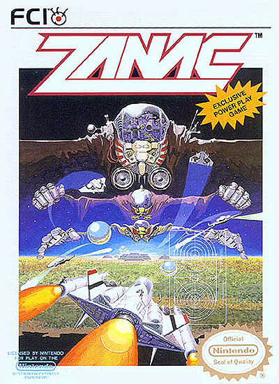
The game, according to the cover art: There?s a ship that shoots things?and has radar?and some optical illusions maybe? If you start looking at the image from the top down, you?re screwed. Go from the bottom up. It?s the only part that makes sense.
The game, in reality: It?s a hardcore (as explained by the fine folks at Destructoid) vertical shoot-em-up where your goal is to survive against some maniacally evil AI. And apparently there?s a story somewhere in there about the System and saving the universe.
What the fuck? factor: 8.5/10. The game kicks ass, but boy howdy there?s something fucked up about that box art. It reminds me of that movie In the Mouth of Madness. The more you explore it, the more twisted and nasty things get. I swear, it gives me the willies.
5) Kabuki Quantum Fighter
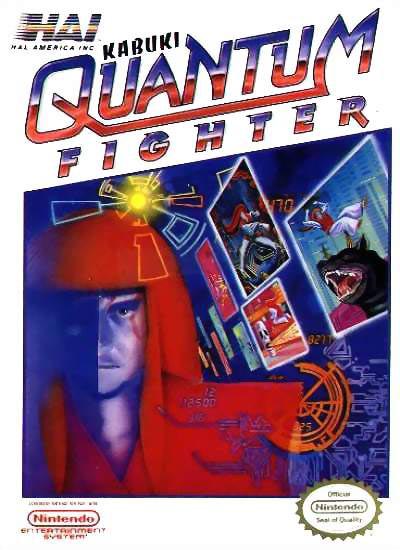
The game, according to the cover art: A cyberpunk Kabuki fighting game. With a demon dog thing. Sweeeet.
The game, in reality: A Ninja Gaiden-style action game where you?re a dude who has to save the world by going into the Matrix to battle an unnamed enemy while harnessing the Kabuki powers of his ancestors?in the form of long, deadly hair.
What the fuck? factor: 8.8/10. It?s like a car crash between cast-off second rate William Gibson ideas, bad graphic design and Kabuki. It?s totally gruesome, but I can?t stop staring. Fun fact: If Wikipedia is to be believed (and it should be, always), KQF has gained some recent cult status, having shown up in Lost, Arrested Development and Garden State.
4) Blaster Master
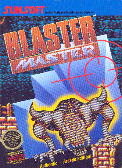
The game, according to the cover art: There?s a sick monster! You either play as it or you have to defeat it, but either way, that?s gonna be off the hook!
The game, in reality: One hard motherfucking game. Sometimes you?re in a ship, blasting away. Sometimes you?re a big-headed dude, blasting away. Usually, you?re dying. I don?t think I knew anyone who beat it when I was a kid. As for that sick monster, he?s equally as sick-looking at the end of the game.
What the fuck? factor: 9/10. The game?s cover really gives no clue as to what lies ahead, which in and of itself is messed up. Toss the messed up looking creature on top and that?s pretty fucked.
3) Galaga
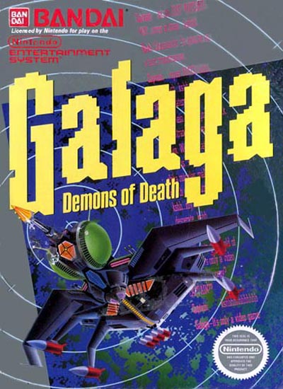
The game, according to the cover art:: It?s very confusing. Galaga is a well-known game, a vertical arcade shooter. But this? Demons of Death? Something that looks like one of the Insecticons? It must be Galaga on acid!
The game, in reality: It?s Galaga. No acid.
What the fuck? factor: 9.5/10. This definitely hits that sweet spot of misleading cover art. By bridging the name recognition of Galaga with that blocky font and the weird ship design, the mad minds behind Bandai cooked up something nice and twisted.
2) Stinger
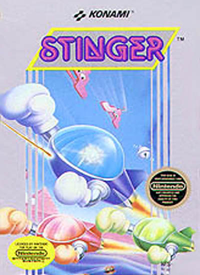
The game, according to the cover art: Who the fuck knows? Laser-firing space ships with boxing gloves? Flying coat hangers with googly eyes? A bell? A pyramid? This could go anywhere.
The game, in reality: A spectacular shoot-em-up with levels varying between vertical and horizontal. Yes, you control a laser-firing space ship that wears boxing gloves. Yes, you fight flying coat hangers (and pretzels and boots and other previously inanimate monstrosities). Yes, there are pyramids. Yes, bosses include pit-spitting watermelons and a boom box (okay, those aren?t pictured on the cover).
What the fuck? factor: 9.8/10. The cover art is pretty fucking wild, but, strangely enough, it pales in comparison to weird shit found in the game?and the other games in the mostly Japanese series.
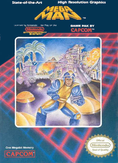
1) Mega Man
The game, according to the cover art: Well, there?s an old dude with a gun and maybe a palace or a city in the background. A pretty standard failure.
The game, in reality: One of the most beloved and easily recognized franchises in videogames. The main character is a robot boy with a gun for an arm who has to battle enemies and save his scientist father. It?s like AI but not as pretentious.
What the fuck? factor: 10/10. C?mon, this one was a no-brainer. I?m pretty sure there are academic papers dedicated to the cover art to Mega Man and how utterly atrocious, yet beautifully chaotic it is. For added fun, check out the covers to Mega Man 2 and Mega Man 3 to see how long it took Capcom USA to get their shit together.
About The Author
Robert Bricken is one of the original co-founders of the site formerly known as Topless Robot, and its first editor-in-chief, serving from 2008-12. He brought the site to prominence with “nerd news, humor and self-loathing” as its motto, raising it from total internet obscurity to a readership in the millions, with help from his savage “FAQ” movie reviews and Fan Fiction Fridays. Under his tenure Topless Robot was covered by Gawker, Wired, Defamer, New York magazine, ABC News, and others, and his articles have been praised by Roger Ebert, Avengers actor Clark Gregg, comedian and The Daily Show correspondent John Hodgman, the stars of Mystery Science Theater 3000 and Rifftrax, and others. He is currently the managing editor of io9.com. Despite decades as both an amateur and professional nerd, he continues to be completely unprepared for either the zombie apocalypse or the robot uprising.