
The G.I. Joe Movie Poster Is an Ode to Awfulness
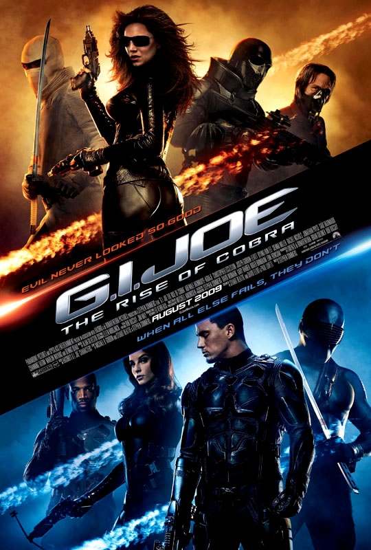 |
This is the international movie poster for the live-action G.I. Joe: The Rise of Cobra movie. Now, as regular TR readers might know, I might have some reservations about the potential quality of said movie (i.e., I think it will suck shit), but let’s examine this movie poster purely on its own merits:
…
I can’t. There are no merits. But I can judge it based on its own flaws, and not the flaws of the movie. Really. Check it:
? The have photoshopped Siena Miller’s head as to barely look human.
? They also have photoshopped large, bizarre sunglasses on her, which are not even close to the glasses she sports in the movie.
? It looks like the Baroness has smoke erupting from her ass.
? They didn’t photoshop Storm Shadow’s “ninja outfit,” and instead allow it to look like a biker jacket made from a towel.
? It features “The Doctor,” as opposed to Destro, or Zartan, or Cobra Commander, or any of the more recognizable and beloved Cobra characters… or just using no character at all. Seriously, look at him — he looks like Dwight from The Office hooked to a respirator — tell me that more people wouldn’t want to see the movie if the poster didn’t feature him at all.
? For the Joe side, Duke is forlornly staring at Scarlett’s tits.
? Snake Eyes is positioned in a way that he is obviously not even close to on the same plane of existence, unless he is 8-feet-tall and standing two steps below and behind Duke.
? Also, if Snake Eyes is not 8-feet-tall, he’s carrying the shortest samurai sword ever made.
? In this bizarre world without physical rules, Ripcord is a mere 4-feet-tall.
? And last but not least, the poster’s designer has jammed two utterly exclusive catchphrases into the poster, where they can do nothing but clutter and confuse. Well done, sirs. Well fucking done indeed.
I could go on about the how the accelator suits they put the Joes in are so fucking boring that they had to give the bad guys the top spot on the movie poster, or how the only characters on the poster who looks even slightly like G.I. Joe are the Baroness and Snake Eyes, who make up less than 25% of the poster’s real estate. I could talk about how horrible the whole idea of the Doctor is, but honestly, I think this poster sums up much more eloquently than I ever could about how awful this movie is going to be. It looks like a bunch of foreign kids made their own home-made G.I. Joe fan movie… but only having second-hand stories about G.I. Joe to go on, and never having seen one of the toys or the cartoon episodes. Because this disaster looks cheap as hell, and it bares virtually no resemblance to G.I. Joe.
PS — Poster designer? For the record: Evil has looked so good. It’s often looked much, much better, in fact. And the Joes? They’ve already failed harder than you’d ever believe.
About The Author
Robert Bricken is one of the original co-founders of the site formerly known as Topless Robot, and its first editor-in-chief, serving from 2008-12. He brought the site to prominence with “nerd news, humor and self-loathing” as its motto, raising it from total internet obscurity to a readership in the millions, with help from his savage “FAQ” movie reviews and Fan Fiction Fridays. Under his tenure Topless Robot was covered by Gawker, Wired, Defamer, New York magazine, ABC News, and others, and his articles have been praised by Roger Ebert, Avengers actor Clark Gregg, comedian and The Daily Show correspondent John Hodgman, the stars of Mystery Science Theater 3000 and Rifftrax, and others. He is currently the managing editor of io9.com. Despite decades as both an amateur and professional nerd, he continues to be completely unprepared for either the zombie apocalypse or the robot uprising.