Press Release Thursday: “DC Entertainment Reveals New Brand Identity”
 |
?New identity designed to showcase DC Entertainment’s rich
portfolio of brands, stories and characters across all media platforms.
BURBANK, CA, January 19, 2012 – DC Entertainment, a
Warner Bros. Entertainment company and home to iconic brands DC Comics,
Vertigo and MAD, revealed today a new brand identity. The new identity
is reflective of the company’s mission to fully realize the value of a
rich portfolio of brands, stories and characters, distinguished by
incredible breadth and depth across publishing, media and merchandise.
So the brand identity is supposed to reflect… the brands? Man, marketing is hard!
A
new logo for DC Comics was also introduced, closely aligning with DC
Entertainment’s new mark.
“But the important part is that brand identity! Which… is technically just the logo! Okay, look, it just sounds less impressive when we only say we changed the logo, okay?”
“It’s a new era at DC Entertainment and the new look reflects a
dynamic, bold approach while at the same time celebrates the company’s
rich heritage and robust portfolio of characters,” stated John Rood, EVP
of Sales, Marketing and Business Development for DC Entertainment.
The logo looks like a dynamic, bold NoteTab, John. It’s celebrating goddamn office supplies.
“It
was just a few months ago that Superman, Batman and many of our other
Super Heroes were updated when we launched DC Comics – The New 52 and
now it’s time to do the same for the company’s identity while remaining
true to the power of storytelling which is still at the heart of DC
Entertainment.”
“Because relaunching the entirety of DC Comics and using a brand-new logo at the same time would have been madness! Also that would indicate we put any thought into any of this, which we didn’t.”
DC Entertainment worked with Landor Associates, one of the world’s
leading brand consulting and design firms, to develop an identity that
creates a visual connection among the company, its three brands DC
Comics, Vertigo and MAD and its vast array of properties as well as
celebrates the power of the company’s stories and characters.
DON’T YOU SEE ALL THE CELEBRATION GOING ON IN THE LOGO IT’S PRACTICALLY EXPLODING WITH JOY
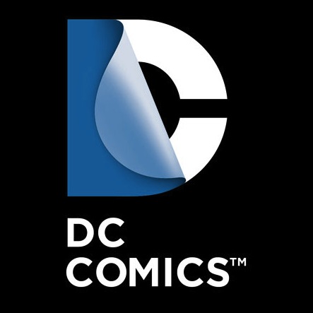
The
design of the new DC Entertainment identity uses a “peel” effect – the D
is strategically placed over the C with the upper right-hand portion of
the D peeling back to unveil the hidden C – symbolizing the duality of
the iconic characters that are present within DC Entertainment’s
portfolio.
In all seriousness, folks — if you feel you have to explain what the logo is in your press release, maybe you need a new logo.
“It was our goal to capture DC Entertainment in a dynamic and
provocative identity. Our solution is a living expression which changes
and adapts to the characters, story lines and the ways fans are
consuming content,” explains Nicolas Aparicio, Executive Creative
Director at Landor’s San Francisco office.
…by NoteTab?
“The new identity is built
for the digital age, and can easily be animated and customized to take
full advantage of the interactivity offered across all media platforms.”
That actually makes sense. I’ll give you that one.
The new brand identity will come to life across all consumer touch
points in order to create a clear and consistent message in support of
DC Entertainment.
Show me on the consumer where DC’s new brand identity touched you.
The new identity will begin to appear on comic books
and graphic novels as well as new websites in March. Consumers will
also see the new identity rolled out over time on other DC Entertainment
products from Warner Bros. including film, television, interactive
games and merchandise.
“Seriously, we couldn’t get our shit together for the comic relaunch, so clearly there’s no hurry putting it on everything else.”
“We believe our new brand identity will strongly resonate with our
loyal fans who will want to proudly express their affinity for DC
Entertainment and their passion for their favorite stories and
characters, this new look allows them to easily do this.”
How’s that? How does the new logo allow fans to express their “affinity” for DC? Let me answer that: It doesn’t. Because you’re talking complete bullshit. It’s not like you’re holding a vote to let fans choose the logo or how its used. So shut the hell up.
“In addition we
were excited to update our identity, it’s not often a company gets to
revisit something as important as its brand and we took the opportunity
to make sure it represented the multi-media business we set out to build
with the formation of DC Entertainment,” said Amit Desai, SVP of
Franchise Management for DC Entertainment.
Bleagh.
The thing that actually drives me most insane about this is that I got this press release directly from DC’s news website The Source, the one that’s ostensibly for the fans. DC doesn’t even have the wherewithal to sit down and explain the new logo to their fans. The sad thing is that I think there’s actually a good idea behind the logo, and if someone from DC said, “Look, guys, I know the logo looks bland at first, but really, it’s just a base. We’re planning on making the ‘C’ different for everything, not just Vertigo comics and Mad, but like Green Lantern will have a green glow, the Flash will have an electric C, and so on. It’s even cooler online and in movies and things, because then we can animate it, too. And since the live-action stuff is such a big part of the business nowadays and since the comics part is slowly but surely moving entirely online, it just made sense to us to have a logo that made use of that. We hope you’ll give it a chance!”
But nope, instead DC fans get the same buzzword-infested, totally unintelligible press release that places like Fast Company get. Great. Awesome. Well, I’m sure the next time the marketing industry and DC comics fans get together at their weekly luncheon the marketers will explain the press release to ’em. No need for DC to do anything more. Just sit back and pop the bubbly.
About The Author
Robert Bricken is one of the original co-founders of the site formerly known as Topless Robot, and its first editor-in-chief, serving from 2008-12. He brought the site to prominence with “nerd news, humor and self-loathing” as its motto, raising it from total internet obscurity to a readership in the millions, with help from his savage “FAQ” movie reviews and Fan Fiction Fridays. Under his tenure Topless Robot was covered by Gawker, Wired, Defamer, New York magazine, ABC News, and others, and his articles have been praised by Roger Ebert, Avengers actor Clark Gregg, comedian and The Daily Show correspondent John Hodgman, the stars of Mystery Science Theater 3000 and Rifftrax, and others. He is currently the managing editor of io9.com. Despite decades as both an amateur and professional nerd, he continues to be completely unprepared for either the zombie apocalypse or the robot uprising.